


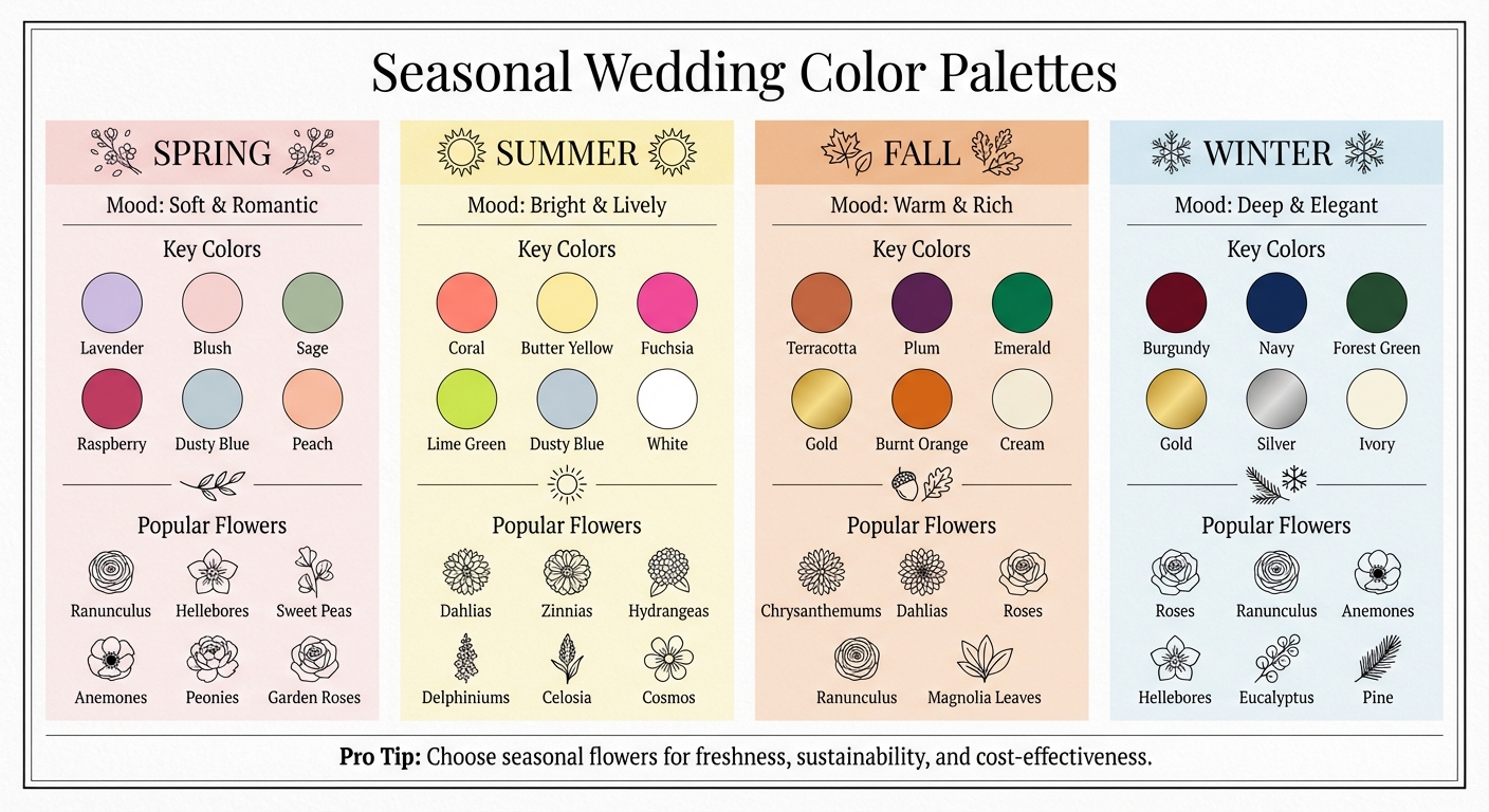
Your wedding colors set the tone for your big day, influencing everything from flowers to decor. Seasonal palettes make this process simple by reflecting nature’s best hues for each time of year:
- Spring: Soft pastels like lavender, blush, and sage, or trendy contrasts like raspberry and blue.
- Summer: Bright, lively shades such as coral, butter yellow, or bold fuchsia paired with lime green.
- Fall: Warm, rich tones like terracotta, plum, and emerald, often paired with metallics like gold.
- Winter: Deep jewel tones like burgundy, forest green, and navy, accented by silver or gold.
Each season offers a unique mood and abundant blooms that match its natural rhythm. By choosing colors that align with the time of year, you’ll create a wedding that feels unified and visually stunning. Keep reading for specific palettes and tips to personalize your floral design.
Seasonal Wedding Color Palettes Guide: Spring, Summer, Fall, and Winter
Wedding Colors 2026 | 12 Modern, Bold & Timeless Color Palettes
sbb-itb-2be19a4
Spring Wedding Color Palettes
Spring offers a perfect backdrop for weddings, with its blooming flowers, longer days, and pleasant weather. These conditions make it easier to create stunning floral arrangements, ranging from delicate pastels to striking contrasts.
For the 2026 wedding season, couples are steering away from neutral tones and embracing more expressive color combinations. Taylor Alber from THE WED highlights this trend:
Spring 2026 is shaping up to be a season of bold contrast, tonal layering, and palettes that feel expressive rather than expected.
Here are three standout color palettes that perfectly capture the season's vibrancy.
Raspberry Blush and Sage
This pairing combines the boldness of raspberry with the earthy charm of sage. Raspberry, a trending bridal color for 2026, offers a sophisticated alternative to traditional pinks. Flourish Flower Farm notes:
Raspberry is one of this year's breakout bridal colors. Deeper and brighter than blush... it is a great way to add depth and a pop of color to a spring wedding palette.
To bring this palette to life, consider early-spring blooms like ranunculus, hellebores, sweet peas, and anemones for the raspberry tones, complemented by sage-hued greenery. Layering shades within the same color family adds dimension, with raspberry providing richness and sage grounding the arrangement in natural elegance.
Lavender and Blush
This timeless pastel duo captures the soft, romantic feel of spring. It works beautifully in outdoor settings, where natural light enhances the delicate tones, making it a favorite for countryside weddings.
To achieve this look, use peonies, garden roses, hydrangeas, and orchids in rich lavender shades, paired with soft blush blooms for contrast. The coolness of lavender balances the warmth of blush, creating a visually soothing yet dynamic effect. Let lavender take center stage while blush adds a gentle touch of softness for a cohesive and dreamy aesthetic.
Dusty Blue and Peach
This refined combination evokes the essence of spring mornings transitioning into sunny afternoons. Dusty blue offers a calming, sophisticated foundation, while peach introduces a warm, inviting glow.
Incorporate garden roses, sweet peas, and ranunculus in peach tones, and use dusty blue for accents like ceremony drapery or table linens. The result is a clean, polished look that feels both fresh and elegant.
Summer Wedding Color Palettes
As spring's gentle pastels fade, summer steps in with vibrant, lively color combinations that bring energy and excitement to wedding celebrations. The trick is blending bold, saturated hues with softer, romantic touches to create a look that's both dynamic and elegant.
For 2026, couples are leaning into expressive palettes inspired by everything from golden afternoons to Mediterranean sunsets. Below are three standout combinations that highlight the season’s best offerings. Just like spring arrangements, these summer florals are carefully designed to feel intentional and cohesive.
Coral and Butter Yellow
This pairing radiates warmth and positivity. Coral adds energy and vibrancy, while butter yellow brings a sunny, cheerful vibe reminiscent of long summer days.
To bring this palette to life, consider using dahlias, ranunculus, zinnias, and garden roses in coral and peach tones, paired with butter yellow peonies and tulips. For added texture and depth, incorporate citrus-inspired centerpieces or amber glassware alongside your floral designs.
Stick to the 60-30-10 rule for balance: let coral dominate 60% of the design, butter yellow fill 30%, and use a complementary shade for the remaining 10%.
Dusty Blue and White
This timeless duo offers a refreshing, elegant contrast, perfect for outdoor or beach weddings. Dusty blue's cool tones transition seamlessly from bright daytime settings to evening receptions by the water.
Use hydrangeas, delphiniums, and white lilies to create lush, weather-resistant arrangements. Let white blooms take center stage in bouquets and centerpieces, while dusty blue can shine in non-floral elements like table linens, ceremony drapery, or bridesmaid dresses. Medium-toned colors like dusty blue also photograph beautifully in outdoor lighting, avoiding the washed-out effect that lighter pastels can sometimes have under direct sunlight.
For couples looking to turn up the energy, there’s always the bold Fuchsia and Lime Green palette.
Fuchsia and Lime Green
This daring palette is all about playful, high-energy vibes. Flourish Flower Farm describes a similar combination:
There's something about this palette that just feels like summer, like strawberry lemonade. It's vivid, playful, and full of energy.
To achieve this look, use celosia, cosmos, gomphrena, and strawberry-hued zinnias for the fuchsia tones. Pair them with chartreuse greenery, pistachio-colored foliage, or succulents for lime green accents. These flowers are naturally heat-tolerant and lend themselves to loose, organic arrangements that feel lively and unstructured.
Keep lime green as a subtle accent - about 10% of the overall design - to avoid overpowering the space. Let fuchsia take the lead for a bold visual impact.
These vibrant palettes showcase summer’s full range of energy and elegance, offering endless inspiration for couples planning their big day.
Fall Wedding Color Palettes
As summer gives way to autumn, nature transforms into a canvas of deeper, richer tones. Fall wedding color palettes take inspiration from this seasonal shift, drawing from harvest landscapes and vibrant foliage to create warm, inviting atmospheres. These palettes are perfect for cozy, intimate celebrations that embrace the essence of autumn.
One standout feature of fall weddings is the emphasis on texture. Danielle and Hannah from Joyfully Gathered highlight this beautifully:
Fall weddings are all about good texture and warm tones in each space you're designing on wedding day. Whether it's a slate velvet napkin, creamy table runner, or sunset inspired floral arrangement, we encourage our brides to lean into the warmth and comfort of the fall season.
Let’s dive into three stunning palettes that will bring warmth and sophistication to your fall wedding.
Terracotta and Cream
This earthy pairing captures the essence of sunlit fields and dried autumn leaves. Terracotta, with its natural warmth, serves as the perfect foundation, while cream or ivory tones soften the overall look to create an inviting and balanced atmosphere.
For floral arrangements, consider roses, chrysanthemums, and dahlias in rust, orange, and blush tones, complemented by accents of sage green or eucalyptus. Rustic venues like barns or vineyards are ideal for this palette, as they echo the natural surroundings. Add elements like dried pampas grass or mini pumpkins to centerpieces for an extra layer of texture.
Kari Dirksen, CEO and Lead Planner at Feathered Arrow Events, suggests keeping the look modern:
Some of my favorite color palettes for fall are sticking with the tones of the season but keeping them subtle and more modern. Include burnt oranges, yellows, reds, and whites with some dried florals, but keep the palette muted and soft so that it doesn't feel overly fall.
Emerald and Gold
For a more sophisticated and timeless look, emerald and gold make a striking duo. Emerald evokes the richness of late-season greenery, while antique gold or brass accents add a touch of elegance. This palette is especially suited for formal indoor venues like ballrooms or historic estates.
To bring this to life, use lush greenery such as magnolia leaves alongside ivory roses for a clean contrast. Add dahlias and ranunculus in cream or champagne tones to soften the richness. Incorporate metallic elements like copper lanterns or gold-rimmed chargers to tie the look together. The combination of jewel tones and metallics shines beautifully in the soft light of early autumn sunsets.
Plum and Burnt Orange
For couples looking to make a bold statement, plum and burnt orange deliver a dramatic, moody vibe. Plum offers a luxurious depth reminiscent of ripe berries, while burnt orange brings the fiery vibrance of autumn foliage.
Create dynamic floral arrangements using plum ranunculus or dahlias paired with burnt orange roses and trailing greenery. Velvet ribbons in plum or terracotta shades can be wrapped around bouquet stems to enhance the richness of the design. This palette is particularly well-suited for winery or vineyard settings, where wine-colored linens and berry-toned blooms can create a cohesive and striking aesthetic. Let plum be the dominant color, with burnt orange as a vibrant accent to balance the overall look.
Fall palettes thrive on seasonal blooms and the expertise of local florists, ensuring a seamless blend of colors and textures that suit your venue. For a custom touch, professionals like Marietta Floral Design can help tailor these ideas to match the unique ambiance of your celebration.
Winter Wedding Color Palettes
Winter weddings offer a chance to embrace the season's charm with color palettes that feel warm, intimate, and elegant. The shorter days and crisp weather create the perfect backdrop for deeper tones, metallic accents, and textures that come alive under candlelight. Here are three palettes that beautifully capture the spirit of winter, blending timeless appeal with a touch of modern flair.
Burgundy and Ivory
Burgundy and ivory make a stunning pair, offering a mix of richness and romance. Burgundy brings a bold, dramatic depth, while ivory softens the look, creating a perfect balance. As Kayla McFadden from THE WED describes:
Classic red carries an intensity that is both regal and intimate. It provides a dramatic counterpoint to winter's cool landscape, making it ideal for floral arrangements, linens, and statement decor.
For a floral arrangement, think deep red roses and ranunculus paired with ivory spray roses and cream-colored hellebores. Add eucalyptus branches or dark greenery for texture, and include light pink or blush accents for a softer, romantic touch. This palette shines in formal venues like ballrooms or historic estates, where velvet napkins, burgundy table runners, and rich fabrics enhance the luxurious vibe.
Navy and Silver
Navy and silver are perfect for couples drawn to cool, serene tones. This palette reflects the crisp elegance of a winter evening while adding a sleek, modern touch. Kayla McFadden notes:
Silver always adds a polished and almost futuristic edge, making every design detail of your wedding feel luminous and elevated.
For floral designs, combine white anemones, ivory ranunculus, and dusty blue thistle, accented with silver-dusted eucalyptus or frosted branches. Bring in metallic details with silver candleholders, mercury glass vases, or silver accents on bouquet wraps. This palette works wonderfully in contemporary venues or spaces with modern architecture, where its cool tones complement clean lines and minimalist designs. To add warmth, use soft white lighting or candlelight throughout the space, ensuring a cozy yet sophisticated atmosphere.
Forest Green and Gold
This pairing brings a festive, elegant feel to winter weddings without leaning too heavily into holiday themes. Forest green echoes the natural beauty of evergreen trees, while gold accents provide a touch of warmth and refinement. As Liumy Albums explains:
Emerald green is rich, sophisticated, and ties beautifully to the evergreen hues found in nature during winter.
Create floral arrangements using pine and eucalyptus as a base, accented with ivory roses and cream ranunculus. Incorporate gold through metallic vases, gold-rimmed chargers, or brass lanterns to complete the look. This palette is ideal for formal indoor weddings or holiday-season celebrations, especially in venues featuring natural wood elements or traditional architecture. To avoid a holiday-centric feel, consider using sage green instead of hunter green and opt for antique gold over brighter metallics. Locally sourced blooms can add a personal touch, highlighting the natural elegance of winter in your celebration.
How to Customize Your Wedding Floral Palette
To make your wedding flowers feel uniquely yours, start by tailoring your arrangement to reflect your personal style. Choose a theme - whether it’s a romantic garden, vintage charm, or industrial chic - to guide your decisions on colors and flower types. A great way to communicate your vision is by creating a mood board. Gather images, fabric swatches, or magazine clippings that capture your desired look. This visual guide will help your florist understand your aesthetic and ensure everyone is on the same page when it comes to color harmony.
Your florist can be an invaluable resource when refining your palette. They’ll know which flowers are in season and can suggest alternatives that match your desired look and feel. For instance, if you love peonies but are getting married in the fall, your florist might recommend dahlias or ranunculus as substitutes that offer similar softness and drama. By combining your vision with their expertise, you can create a floral design that feels both personal and perfectly suited to the season.
Working with Local and Seasonal Flowers
Choosing seasonal flowers has both aesthetic and practical benefits. For example, Marietta Floral Design emphasizes the use of locally sourced flowers, ensuring they’re fresh and aligned with Georgia’s natural beauty throughout the year. If you’re set on a particular bloom, like peonies, consider scheduling your wedding during their peak season - typically late May to early June - to guarantee availability and quality. If that’s not an option, ask your florist about seasonal alternatives that capture a similar vibe.
Another way to make your arrangements special is by working with local growers. This approach not only supports the community but also gives you access to unique flower varieties that aren’t typically available through larger suppliers. To add even more personality, consider incorporating unexpected elements like air plants, potted herbs, or even family heirlooms into your floral design.
Using Color Theory for Balanced Arrangements
A well-balanced color palette is essential for creating cohesive floral arrangements. Stick to three main colors and add a metallic accent for a polished look. This keeps your design visually appealing without feeling overwhelming. A popular strategy is to combine bold jewel tones with neutral shades like ivory, gray, or greenery for a harmonious effect.
It’s also important to check fabric swatches for your dresses and linens to ensure your colors work together. Shades like "blush" or "dusty blue" can look different depending on the material - silk versus cotton, for example - and lighting conditions can further alter their appearance. Taking these factors into account will help you achieve a cohesive look on the big day.
Adjusting Colors for Your Venue and Lighting
Your venue and its lighting play a major role in how your floral palette will look. Before finalizing your colors, take note of permanent details like wall colors and flooring to ensure your flowers complement the space rather than clash with it.
Lighting is equally important. For outdoor weddings at sunset, warm hues like peach, soft pink, and honey gold can enhance the natural glow of golden hour. In dimly lit or winter settings, deep jewel tones like emerald, plum, or navy look stunning when paired with soft candlelight. For bright, sunlit venues, consider tone-on-tone palettes - different shades of the same color - for an elegant and understated effect. If your venue features expansive views, choose colors that blend seamlessly with both the interior decor and the surrounding landscape.
Conclusion
Selecting the perfect seasonal color palette for your wedding does more than enhance its beauty - it creates a celebration that feels in harmony with the time of year. When your floral arrangements reflect what’s naturally in bloom, every detail, from the invitations to the reception decor, comes together seamlessly, creating a cohesive and memorable atmosphere.
Choosing seasonal flowers also supports eco-friendly practices while ensuring your blooms are fresh and radiant. As Wildly Native Flower Farm beautifully states: "Your flowers should be a reflection of your love and your season." This thoughtful approach not only elevates your floral designs but also ties every aspect of your wedding into one unified vision.
Whether you’re drawn to spring’s gentle pastels, summer’s bold corals, autumn’s warm terracottas, or winter’s deep jewel tones, the key is finding colors that resonate with you and match your wedding’s timing.
Marietta Floral Design specializes in crafting bespoke wedding arrangements using locally sourced, seasonal flowers that celebrate Georgia’s natural beauty. Their talented team can guide you through seasonal options, help match floral ribbons to fabric swatches, and design arrangements that perfectly complement your venue’s ambiance. Visit Marietta Floral Design to begin designing wedding florals that feel personal, stunning, and perfectly attuned to your special day.
FAQs
How do I choose wedding colors that match my season and venue?
Start by taking cues from the natural colors of your wedding season. Think pastels and greens for spring, vibrant hues for summer, earthy tones for fall, or deep, rich shades for winter. Once you’ve settled on a palette, consider how your venue fits into the picture. Outdoor spaces often harmonize beautifully with seasonal landscapes, while indoor venues give you more room to experiment with different color schemes. To create floral arrangements that truly reflect your style, reach out to local professionals like Marietta Floral Design - they can help turn your ideas into stunning realities.
What seasonal flowers can replace peonies if they’re out of season?
If peonies are out of season, you might want to explore options like ranunculus, garden roses, or dahlias. These blooms bring a comparable sense of elegance and can complement a range of seasonal color schemes. Talk with your florist to choose flowers that align with both their availability and your wedding's overall style.
How do I make a bold palette look balanced in photos?
To create a balanced look with bold colors in photos, begin by selecting 1-3 sources of inspiration - these could be tied to your venue, the season, or your overall style. Use a neutral base and add 1-2 accent colors to build your palette. Test it out with real materials under various lighting conditions to see how they work together. For added depth, layer different tones and textures. To keep bold hues from overwhelming the image, mix in neutral or softer elements. This approach helps everything feel cohesive and visually pleasing in photographs.